Editor advice: How many photos does a news article need?

Imagine the internet without visuals: it would be pretty bleak, right?
A barren wasteland of words where text colour, bold or italic fonts were the only exotic elements.
It would be miserable, wouldn’t it?

Rarely will we encounter news articles without photos, videos or infographics. But when we do, they stand out. And not in a good way.
Images are not only engaging for readers, they help tell a story and perform valuable heavy lifting behind the scenes for your SEO optimisation.
So how many photos should journalists aim for in a news article?
At a bare minimum, three is the magic number.
1) Hero image
2) Headshot of a source
3) Supporting visual
Here’s why each is important.
1) Hero image

The hero image will be the first thing a reader sees alongside your headline.
Taken together, these two elements determine whether they click through onto your article – both are valuable opportunities, but for now we are just focusing on the image component.
The hero image often serves as the preview image on your website, its feed or in the search results. Choose wisely.
As a rule of thumb, they should always be landscape-oriented as most website CMS’s display story previews this way.
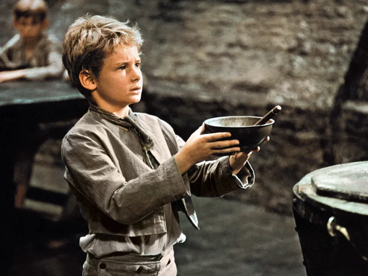
Ideally, they will have faces in them. Eyes capture attention at a psychological level and people like to relate to stories on a human level.
One of the veteran editors I work with has a mantra: ‘Faces, not faeces.’
While a tad graphic, the sentiment stands.

Aim for high-res, quality images as far as possible – blurry or low res photos should be avoided unless there is absolutely no alternative. This remains true for all photos you insert into stories, not just the hero – but it is especially true in such a prominent place.
Ensure the hero image is either relevant to the story directly (best case scenario) or at the bare minimum reflects a theme, place or concept discussed in it (compromise).
Some news stories are just a pain to capture visually: think abstract concepts or things you cannot photograph. Examples might include news related to fintech, the cloud, telecommunications networks and more.
There’s no easy way around this fiddly dynamic, but rooting the story in people and companies certainly helps.
2) Headshot of a source

Striving to have at least one quote from a person involved in the story, an expert on the development or industry commentator is the bare minimum for a compelling news article.
If they’re valid enough to include their voice in the piece, they sure as hell deserve to stick their face to the words – and your readers will appreciate putting a face to the name.
Google likes faces as well, so stick them in as high up in your article as possible.
If you have more than one source or quoted person in the story, stick the most relevant as the hero image – normally whoever’s quote appears first in the piece. Sometimes you might have to trump this if you’re discussing someone more prominent further down the story.
Keep photos of sources as close to their respective quotes as possible to avoid reader confusion.
3) Support image

Rounding out the trio is a support image that reflects the story or theme it addresses.
Not only does this capture the story more clearly in the reader’s mind, it breaks up the article for them.
Readers need breathers
If you hit the bare minimum of three photos, with the hero at the top, the second and third effectively divide the piece into three manageable chunks.
Reader fatigue is real, so throw them some visual relief every few paragraphs and they are more likely to keep scrolling.
A phrase I keep in mind while I write is 'Readers need breathers'. You can gauge where you need to give the audience a break by previewing your story. If you see a wall of text and get a sore thumb scrolling through it, add in some visual relief.
Here are some suggestions for support photos:
- Things: products, technologies or items mentioned in the story
- Places: where is the development unfolding? Can you connect the story to its location?
- Concepts: if you’re struggling to find relevant support photos, think laterally based on the themes or topics you’re tapping into with the words.
More?
Three photos are the bare minimum. But that doesn't mean you shouldn't aim higher where appropriate.
Have you secured quotes from more than one or two people? Fab - add them in.
Are you writing a long form feature or lengthy analysis? Remember the mantra 'Readers need breathers' and break that sucker up.
Does the story cover multiple themes? Great - capture them.
With this trio serving as a checklist, your story will be in a solid place to engage readers.
While you're here...
Thank you for stopping by. If you enjoyed the post and think others might do too, I would greatly appreciate it if you helped me reach them.
One way you can help is by sharing this article on social media or forwarding it to anyone you think might get value from these posts and the newsletter.
Another is by heading over to LinkedIn and connecting with me – it’s the social media platform I use most so you're most likely to catch me there.
If you are new here - click the button below to join the community receiving my newsletter.


Member discussion